From gnuplot to Matplotlib & Pandas
I’ve been using gnuplot since.. like forever. It is one of my best friends
in plotting data and discovering what is going on. But for all its
greatness, you do tend to run into a wall - once you step outside the things
gnuplot is good at, suddenly large heaps of awk, sort, unique and odd
shell scripts are required to get to the next level. This is no criticism of
gnuplot - it is great for what it is for.
And to be sure, gnuplot’s fitting abilities for example go beyond what could
be expected of a plotting package. While sometimes quirky, the fit f(x)
functionality has helped me discover a lot of interesting things.
I love gnuplot. But it is time to move on.
April 2021 update: Nicolas Burrus wrote a wrapper that creates Matplotlib notebooks from simple data files. This could help you get started too.
In this post, I hope to provide a highly accessible introduction to Matplotlib and Pandas which, together, blow gnuplot right out of the water.
Note: I am by no means an expert or seasoned user of Matplotlib and Pandas. In fact, I started this trek only a few weeks ago. If you spot any mistakes or “worst practices” in here, please let me know (bert@hubertnet.nl) and I’ll fix it. A few actual experts have looked at this page and did not immediately report big problems.
This article, sample datasets and a notebook to explore Matplotlib & Pandas are available on GitHub
Key differences
Launch gnuplot, enter plot sin(x).. and you have a plot. This is why
gnuplot fits so well in the life of a system administrator or software
developer. Want to plot the number of context switches of your system?
Just do this:
$ vmstat -n 1  | awk '{print N++, $12; fflush()}' > plot
$ gnuplot
> plot 'plot' using 1:2 with linespoints
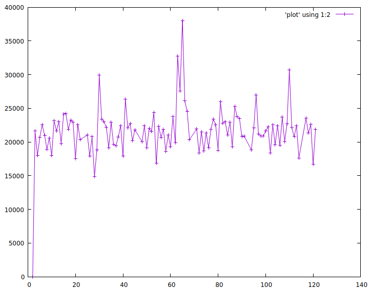
Gnuplot is ready to go. Other graphing solutions require configuration, web browsers and other newfangled things. It is not easy to let go of such commandline ease of use.
The example above however did show that quite a lot of the work gets done
outside of gnuplot - we needed a somewhat awkward awk program to
preprocess the output of vmstat before gnuplot could get to work. Gnuplot
meanwhile has no idea what it is plotting - it only sees numbers.
The Pandas & Matplotlib way
Gnuplot itself can read data from a prepared file. In the brave new world of Pandas and Matplotlib, data storage is separated from the actual graphing as well. But it does all reside within one programmatical environment, where data is labelled with what it is.
Here’s how we’d analyse the output of vmstat “the Pandas way”. First we generate a csv file with source data:
$ TZ=UTC vmstat -t -n 1 | sed -u 's/UTC/Date time/' > vmstat.csv
We can let this run, the file will grow as it happens. This takes the timestamped output from vmstat but replaces the UTC field in the header by two fields called ‘Date’ and ’time’ - since it is actually two fields.
Next up we load this csv file into Pandas:
data=pandas.read_csv("vmstat.csv", delim_whitespace=True, skiprows=[0,2])
data["timestamp"]=pandas.to_datetime(data["Date"] + " "+data["time"],
	infer_datetime_format=True, utc=True)
data.set_index("timestamp", inplace=True)
The first line says this is a csv file with whitespace as a separator. The
skiprows statement means we skip the first line of vmstat output, which
contains a summary, plus the first actual data line which contains
statistics of the system since bootup.
The second line converts the pretty printed vmstat timestamp into a
’native’ Pandas timestamp. Note that we explicitly say these are UTC
timestamps.
The final line then blesses the newly generated timestamp field as the
index of our data.
I agree this was some pain compared to gnuplot, but our reward is swift:
plt.figure()
plt.plot(data["cs"])
plt.plot(data["in"])
plt.legend()
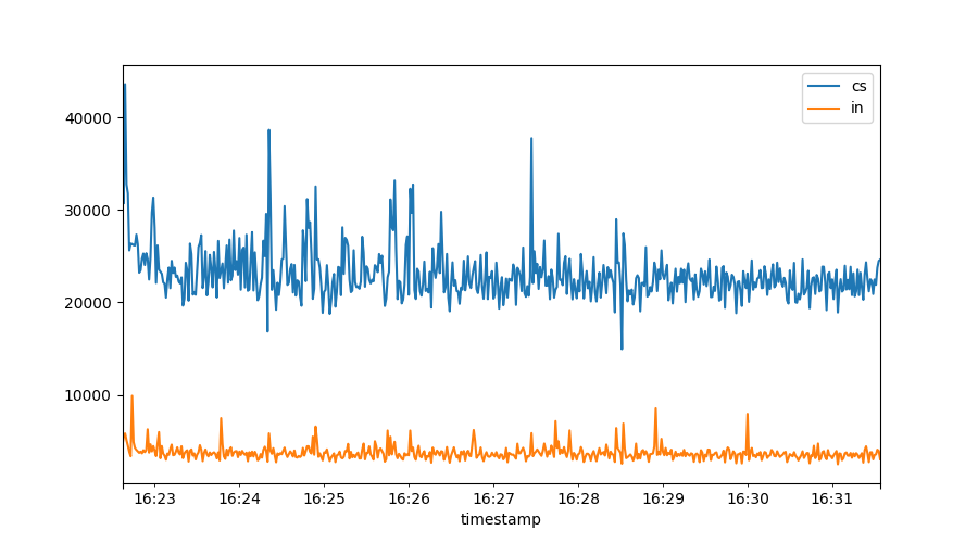
All vmstat fields are available for plotting. Note how the graph is
automatically time aware. There is also an automated legend to show us what
we plotted.
From this graph we see there might be some kind of relation between the number of context switches and interrupts, let’s see if we can tease it out:
plt.figure()
plt.scatter(data["in"], data["cs"], marker='.')

plt.xlabel("Interrupts")
plt.ylabel("Context switches")
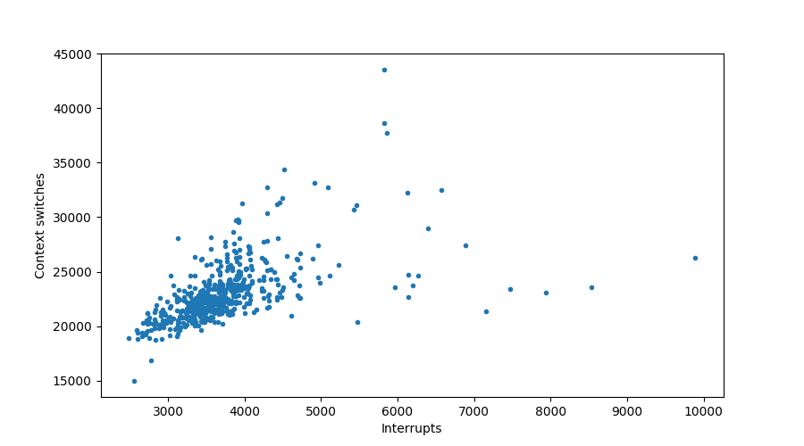
Sure looks like it!
But does it scale? All this newfangled stuff, surely it can’t deal with millions of lines? Turns out, the Pandas people have been at it for a while. I routinely process tens of millions of datapoints with Pandas and
read_csvis up to it.read_jsonnot so much though!
Time windows
Often we will want to look at noisy data, which we can best do through the
lens of a time window. For example, if we naively plot the ‘us’ percentage of our
system, we might get this graph:
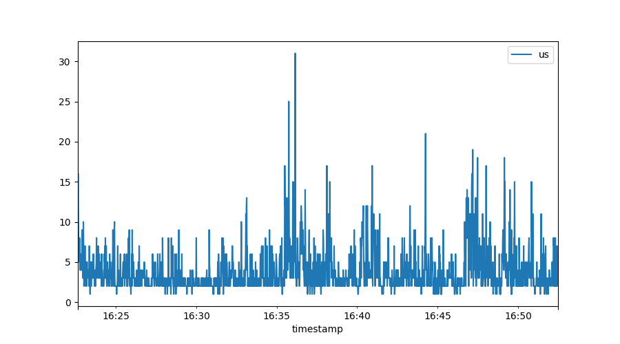
Because we have per-second resolution (which is great!) it is hard to spot trends in here. Pandas, the data component, has very strong support for defining time windows:
plt.figure()
period="30s"
rolledUS=data["us"].rolling(period)
rolledUS.mean().plot(label=period +" average US%")
rolledUS.quantile(0.9).plot(label=period +" 90th percentile US%")
rolledUS.max().plot(label=period +" max US%")
plt.legend()
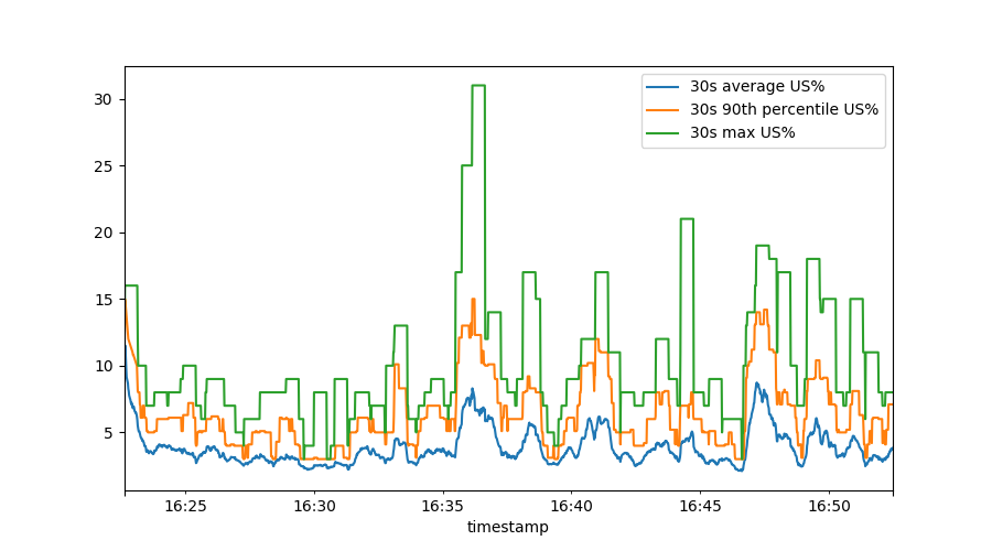
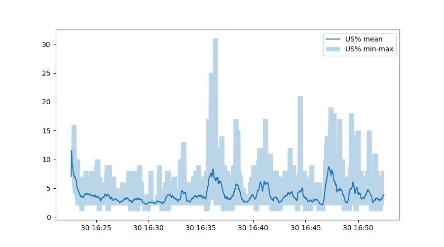
This shows us, over a sliding 30 second time window, the mean (average) user percentage, the 90th percentile and the maximum. To make this really pretty, we can do:
plt.figure()
plt.plot(rolledUS.mean(), label="US% mean")
plt.fill_between(data.index,
                 rolledUS.min(),
                 rolledUS.max(),
                 alpha=0.3, label="US% min-max")
plt.legend()
The third line is somewhat interesting - this calls on Matplotlib to fill
the area between the minimum and maximum user CPU percentage, but uses the
original timestamp from the data variable.
Exploring our data
We’ve been using the data variable for plotting purposes so far, but much
more is possible. A wonderful command is .describe():
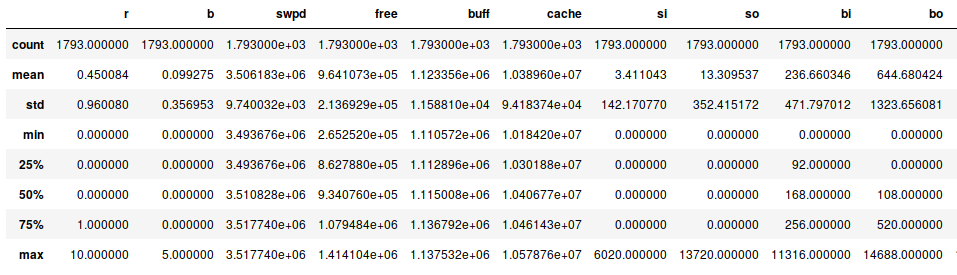
This provides a summary of our data (where not all fields fit on this
screenshot). But already this summary tells us something - we have 1793
lines of data. And apparently, our system does sometimes swap data! Both
si and so are mostly zero, but not always. From the 25%, 50%, 75%
percentile numbers (which are all zero) we can see these swap events must
have been bursts.
We also see that at one point, 10 processes were running at the same time. Let’s see how often we have a lot of active processes:
plt.figure()
data.r.hist(bins=10, density=True)
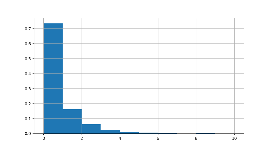
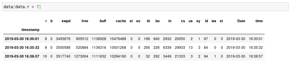
Here we can see that >70% of the time, nothing was running. The number of times we had 10 active processes was tiny. Let’s zoom in on the times when more than 7 processes were running:
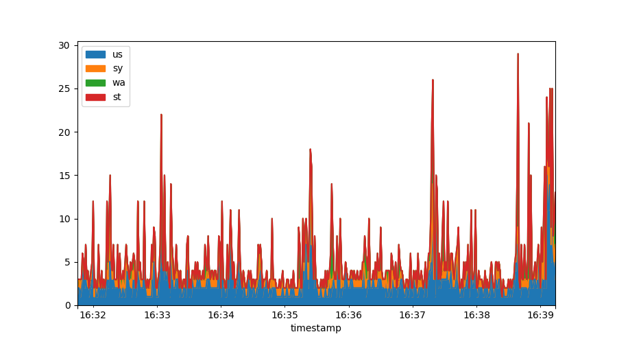
Stacked graphs
Often you may want to stack data, something that is very difficult within gnuplot. In Matplotlib & Pandas it is trivial:
data[["us", "sy", "wa", "st"]].plot.area()
Derivatives
Oftentimes we will get metrics that represent things like “the number of bytes read since startup” - to make any sense of these numbers requires us to take a derivative. In this section we’ll cover how Pandas deals with this.
First, we’re going to collect some more data, this time on disk operations:
#!/bin/bash
echo timestamp maj min dev reads rdmerges rdsectors rdtime writes   \
	wrmerges wrsectors wrtime ioprogess iotime wiotime discards \
	discardmerges discardsectors discardtime
while true
do
	tstamp=$(date +%s)
	IFS=$'\n'
	for line in $(cat /proc/diskstats)
	do
		echo $tstamp $line
	done
	sleep 1
done
Run this as ./diskstat > diskstat.csv and it will measure how our devices
are doing, every second. After this has run for a while, load up the data:
diskstat=pandas.read_csv("diskstat.csv", delim_whitespace=True)
diskstat["timestamp"]=pandas.to_datetime(diskstat["timestamp"],
	infer_datetime_format=True,
	unit='s', utc=True)
diskstat.set_index("timestamp", inplace=True)
diskstat.head()
This follows the same pattern as earlier, except this csv file requires no
preprocessing in terms of skipping lines or joining fields. On line two we
bless the output of date +%s as the timestamp and again mark it as UTC.
The unit='s' part tells Pandas these are unix timestamps. We then bless
the timestamp as our index & output the first 10 rows to check if it all
parsed right.
/proc/diskstat offers us counters on disk operations, and with one
exception, all these counters increase monotonically. Here is how we would
graph the io bandwidth of sdb:
sdb = diskstat[diskstat.dev=="sdb"]
plt.figure()
plt.plot(sdb.index, 512*sdb.rdsectors.diff(), label="bytes read/second")
plt.plot(sdb.index, 512*sdb.wrsectors.diff(), label="bytes written/second")
plt.legend()
We first select only data from device sdb and then plot the derivative of
the number of sectors read and written, multiplied by 512 to get to the
number of bytes:
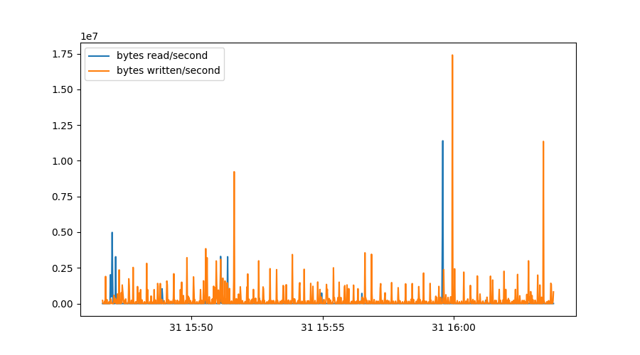
Some things should be noted about this graph. We could simply use diff()
to get per second graphs - because this data was collected every second.
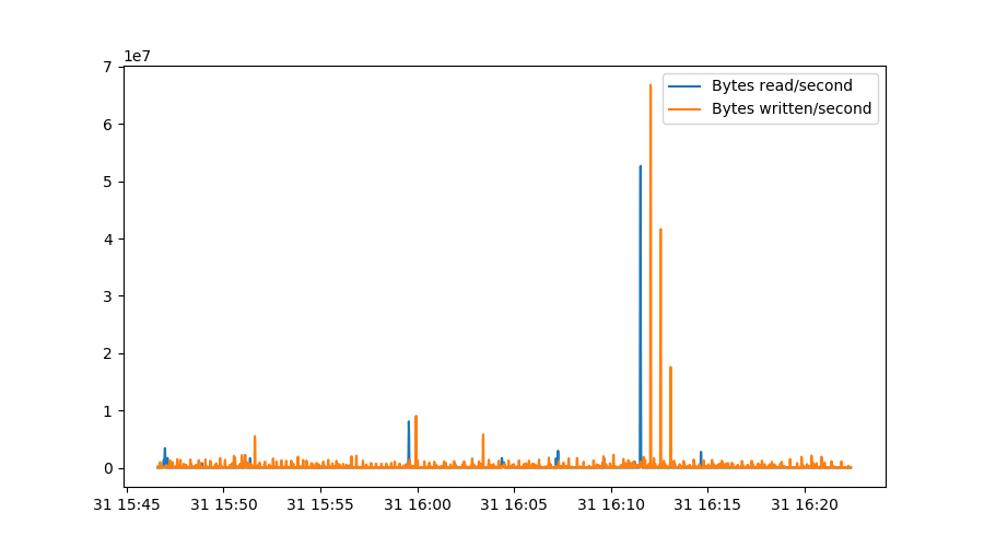
Since we’re using a real programming language with serious scientific packages, we can do way better:
rdrate = 512*np.gradient(sdb.rdsectors, sdb.index.astype(np.int64)/1000000000)
wrrate = 512*np.gradient(sdb.wrsectors, sdb.index.astype(np.int64)/1000000000)

plt.figure()
plt.plot(sdb.index, rdrate, label="Bytes read/second")
plt.plot(sdb.index, wrrate, label="Bytes written/second")
plt.legend()
The first two lines determine the gradient of our rdsectors metric as
measured over the actual timestamps, converted to nanoseconds in this case.
This makes sure our graph stays correct even if samples weren’t collected
exactly every second. Note that np.gradient uses a more sophisticated
algorithm that actually involves three datapoints instead of just the
difference between two lines, which explains why the peaks are slightly
broadened in this graph:
Combining & resampling data
To combine datasets, collected from different places, often requires us to match up data with non-coincidental timestamps. Think of two systems being polled every 30 seconds.. but not exactly on the same second.
In addition, datasets may be noisy at small timescales yet exhibit trends on
longer scales. For example, our diskstat data contains both the number of
read requests and the numbers of sectors actually read. If we want to find
out the average read request size, we need to divide these two numbers by
each other. If we do so on a per second basis, we are unlikely to get a
meaningful graph as some requests may be issued in second n but only
executed in second n+1.
Both combining data with slightly different timestamps as well as doing math on noisy data are solved by the Pandas resampling facility.
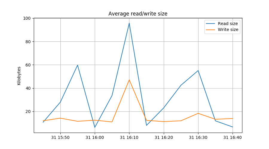
reads=sdb.reads.diff().resample("300s").mean()
rdbytes=512*sdb.rdsectors.diff().resample("300s").mean()
writes=sdb.writes.diff().resample("300s").mean()
wrbytes=512*sdb.wrsectors.diff().resample("300s").mean()

plt.figure()
plt.plot(rdbytes/reads/1024, label="Read size")
plt.plot(wrbytes/writes/1024, label="Write size")
plt.grid()
plt.legend()
plt.ylabel("Kilobytes")
plt.title("Average read/write size")
In the first line, we resample the naive diff() of the number of reads at
5 minute intervals. In the second line we do the same for the number of
bytes read. The next two lines repeat this for writes.
The plot.plt() lines are interesting because they show how resampled
series can be used for calulations.
Selecting data
Pandas, the data component, offers many ways of selecting data. For example,
let’s say we want data from only device sdb, we could do:
diskstat[diskstat.dev=="sdb"].wrsectors.diff().quantile(0.99)
This would select only sdb’s wrsectors metric, calculates its derivative
and tell us the 99% percentile value - a metric of the read performance a
disk would have to provide to keep this system satisfied 99% of the time.
Alternately, selection can happen with:
diskstat.query('dev=="sdb"').wrsectors.diff().quantile(0.99)
This syntax looks nicer but is a bit more fragile. Finally, to ‘&’ selections needs some special handling:
diskstat[(diskstat.dev=="sdb") & (diskstat.ioprogess==0)].wrsectors.diff().quantile(0.99)
Note the additional braces.
Ok, enough of this hotness, how do I get started?
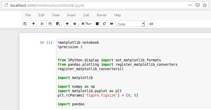
The easiest way to use Matplotlib & Pandas is through Jupyter. This is a webbased environment that offers a smart “CLI” interface to Python, except that it is graphical and you can do and redo commands at will.
Jupyter either comes with your operating system or you can install it with
pip3, like this:
pip3 install jupyter pandas matplotlib numpy
You can then start Jupyter with something like jupyter notebook or perhaps
~/.local/bin/jupyter notebook. This will launch a webserver and will point
your web browser at it.
Then start a new Python3 notebook and paste this into the first cell:
%matplotlib notebook
%precision 3

from IPython.display import set_matplotlib_formats
from pandas.plotting import register_matplotlib_converters
register_matplotlib_converters()

import matplotlib

import numpy as np
import matplotlib.pyplot as plt
plt.rcParams['figure.figsize'] = [9, 5]

import pandas
This sets up sensible defaults. Then press the little ‘Run’ button and it will execute the first cell.
You are now ready to go! I have published the source of this article, the
Jupyter notebook, the diskstat tool and a diskstat.csv and vmstat.csv
dataset on
GitHub for you to
explore.
For further reading, the Matplotlib and Pandas documentation are good reads.
In addition, Matplotlib and Pandas are incredibly well served by searching the web. Almost any question you have will have a pretty decent solution on the first page.
Good luck!